Hydra Restore
A pressure washing firm whose kit was professional and whose website said otherwise.
- Industry
- Exterior cleaning
- Service
- Website redesign
- Year
- 2026
- Location
- Leeds
- Status
- Client work
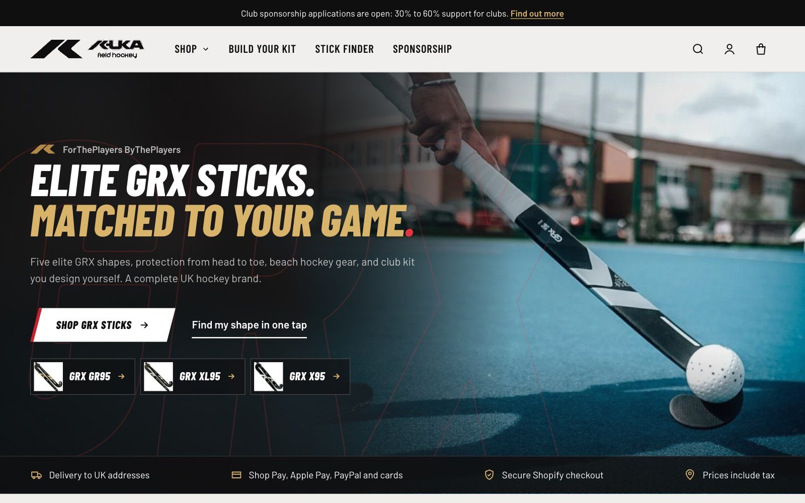
Before and after.
The site the business had, against the one designed for it. Drag the handle to compare.
 BeforeAfter
About the project
01The brief
Hydra Restore had the accreditations, the van mounted equipment and the real before and after results, but a Wix site that hid all of it. A large logo sat over the hero photo, there was no call to action on the first screen, the same services were listed three times down a 12,700 pixel page and the copy was in American English.
02The design
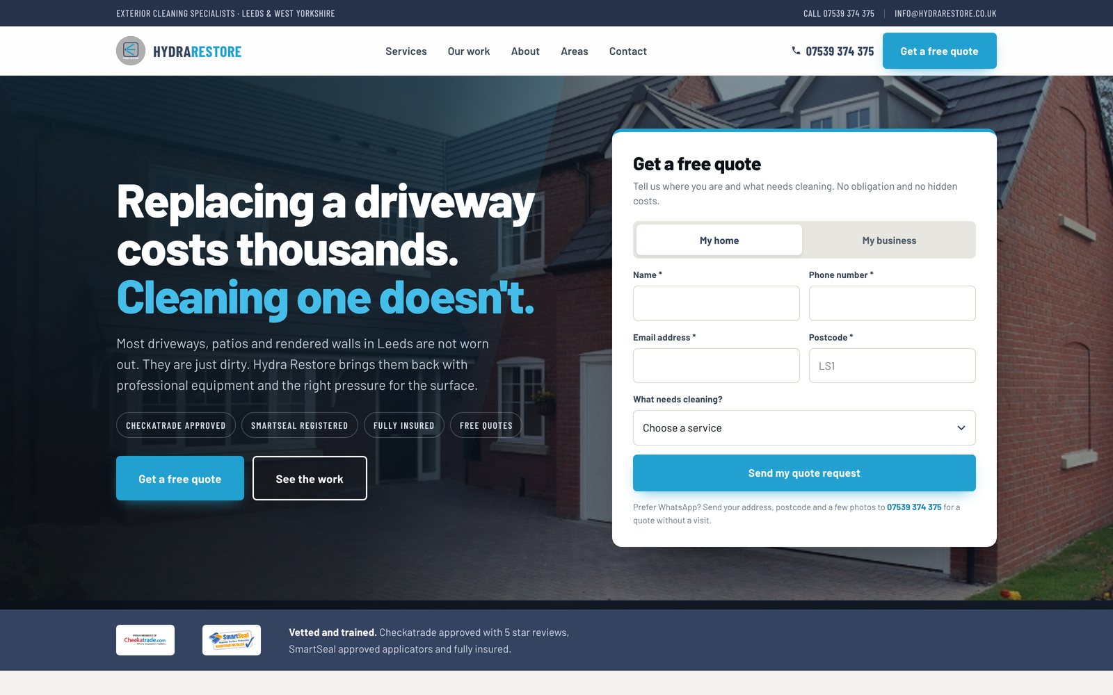
The hero now leads with the commercial argument, that replacing a driveway costs thousands and cleaning one does not, beside a quote form that captures postcode so the business knows immediately whether it can do the job. Deep slate sections let the wet stone photography carry the colour, cyan is reserved for actions, and every image wipes in on the angle of a pressure washer lance.
03How it works
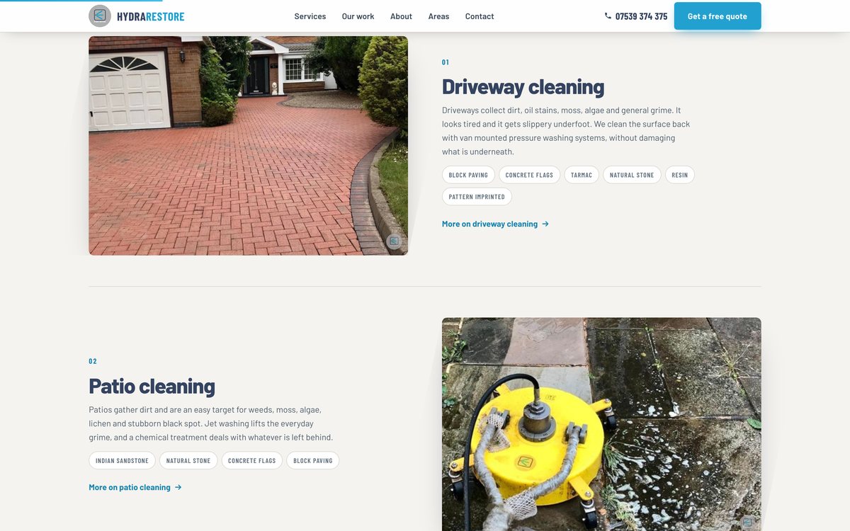
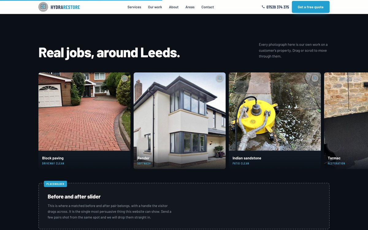
Understand, trust, act. Accreditations sit directly under the hero, services are a numbered list with the matching photo swapping alongside, the gallery is a draggable rail of real jobs and a sticky call bar on mobile keeps the phone number one tap away.
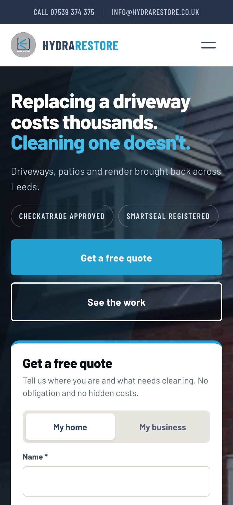
The finished site.
The homepage from top to bottom, the phone layout beside it and two sections up close.

What was delivered.
A thirteen page site: homepage, services hub, seven service pages, about, areas covered, contact and privacy, with existing URL slugs preserved for search continuity, redirects from the old addresses, local business structured data and a full sitemap.
Key features
- Quote form in the hero with postcode capture
- Home or business toggle on the form
- Services linked to real project photography
- Draggable gallery of completed work
- Sticky call bar on mobile
- Existing URLs preserved for SEO